Creative Direction and Graphic Design | Client: Entenmann's
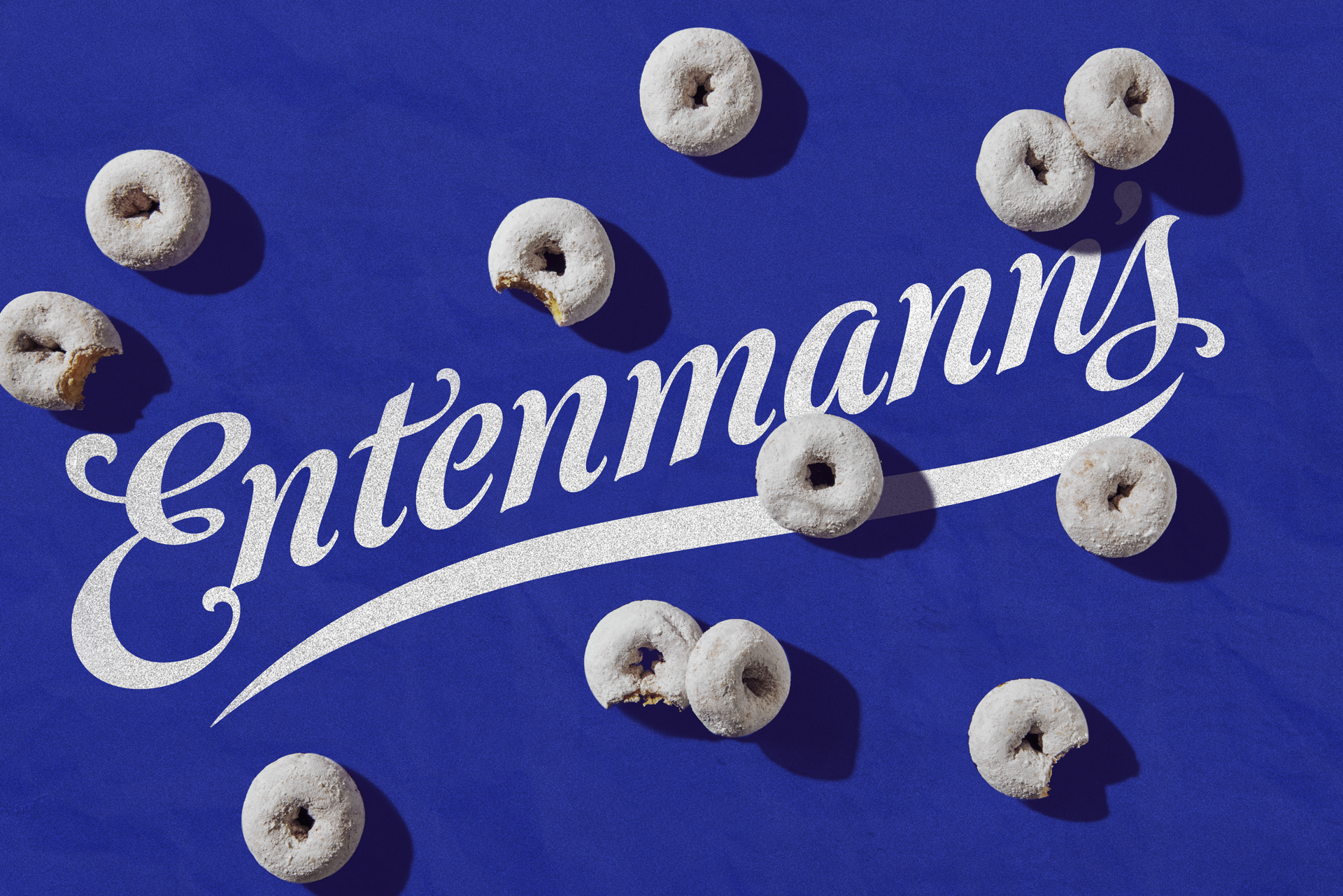
Entenmann’s Rebrand
Entenmann's was a 25-year-old brand that was acting its age. We created a brand new look and feel that paid special attention to its📍Brooklyn, NY roots and its storied legacy in New York culture. We modernized the brand with a new photography style, typeface, and design system, while holding onto all the most special and iconic elements that makes the brand nostalgic for so, so many.

After 125 years inside the blue and white box, these products were finally ready for their closeup.

styling
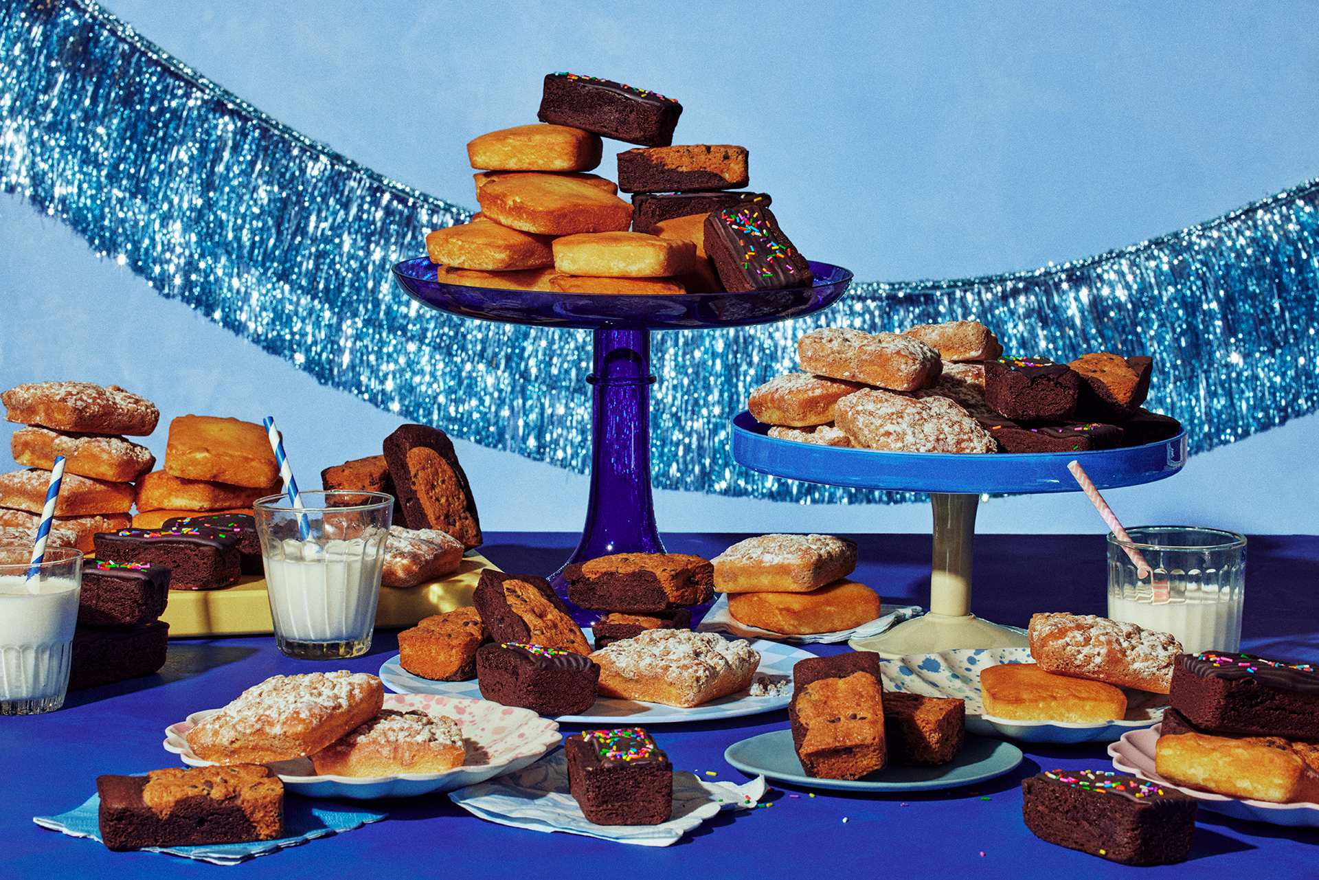
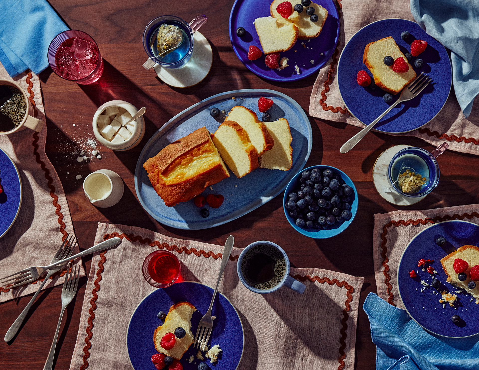
...was designed to put the product in environments where they are actually found. From grandma's vinyle countertop, to a friday night binge-a-thon.

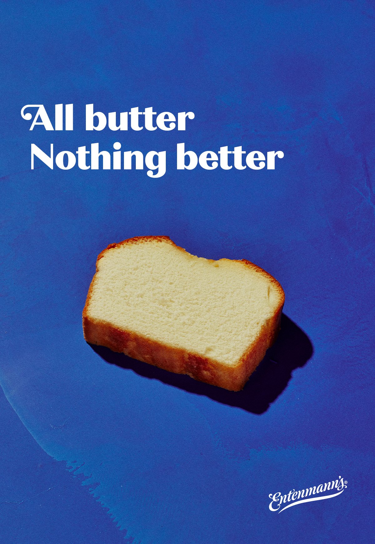
Macro Closeups
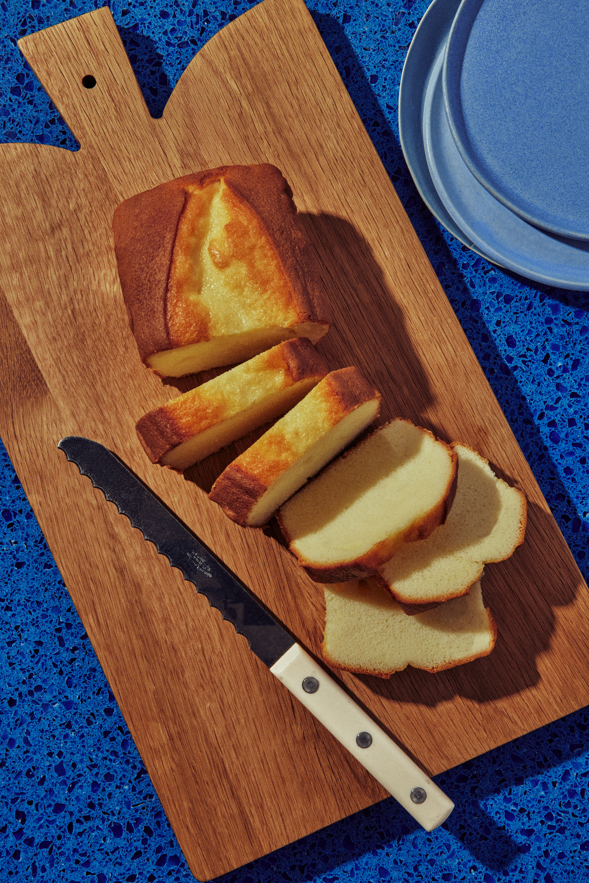
...showcased Entenmann's dedication to quality and that these grocery store pasties had nothing to hide.


Then we put it everywhere
🍩
Then we put it everywhere 🍩

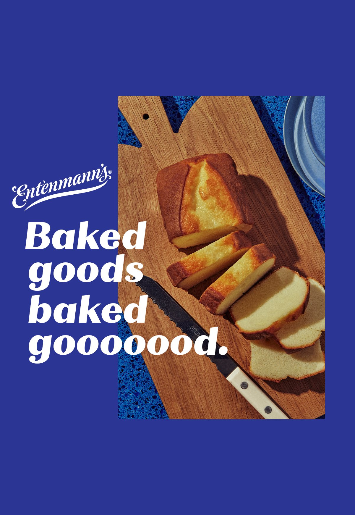
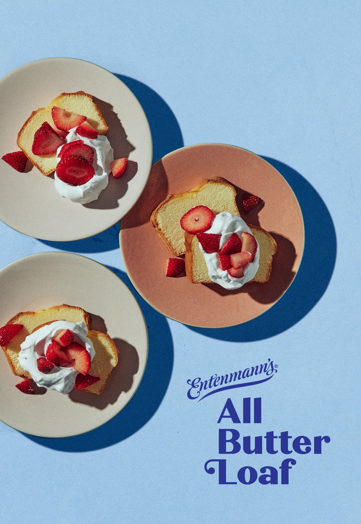


We created a brand new layout system that used a combination of color blocking, dynamic photograpy and bold type to create an ownable look at feel the instantly read "Entenmann's."

We helped to translate the new look into the digital space with eye catching imagery that stands out on social platforms.
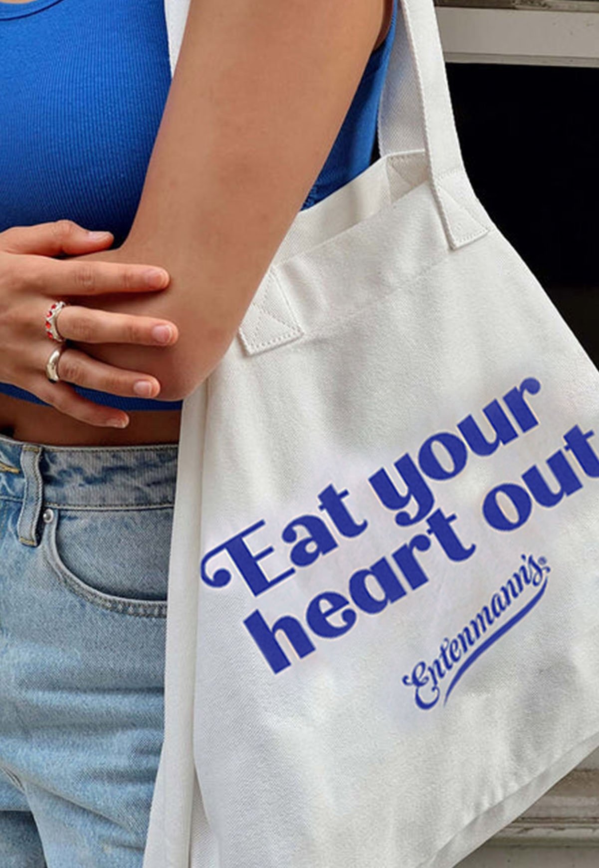


We used nostalgic and retro influences to create swag that spoke to the legacy of Entenmann's, while still feeling fresh and young.
And a fresh new
Website